before making my website i had a little look at what web building sites i could use, having previously used wiz and wordpress and finding that these didnt allow to do all the things i wanted to i decided id check a few out this time before settling on a site to go with.
first i tried
this site initially seemed perfect, everything was really simple and easy and professional looking, though after doing so much i found out why it was so good, the cost to keep the site was pretty ridiculous so i continued to look elsewhere…
until i came across weebly,
http://www.weebly.com/weebly/userHome.php
before singing up i checked out some tutorials and it seemed to be really simple to build a site from scratch. With their simple build tab, you can simply drag on text boxes, image boxes, slideshows, galleries etc, straight on to where you want it. This feature also makes it really easy to edit exist items and shuffle my work around.
http://hc.weebly.com/hc/en-us/sections/200354313-Beginner-s-Guide-to-Weebly
This has also allowed me to do things that other sites would not, which is why it appealed so much. It allows me to create a link from an image, that will open up an entirely separate page where i can include information about my designs and have additional galleries of images such as the different components to my pattern.


It also allowed me to incorporate an online store which was exactly what i was looking for, and the packages should i choose to upgrade to one are pretty reasonably priced.
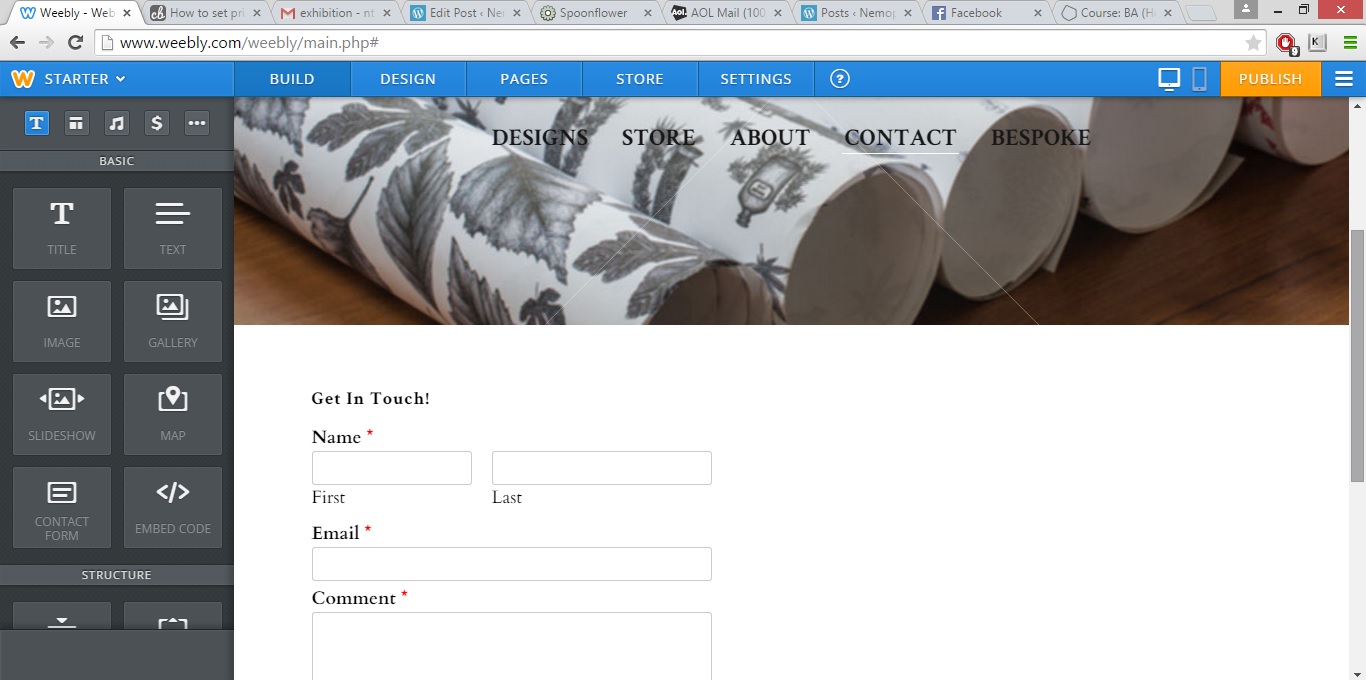
I bought a starter package with them as this allows me to have up to ten products on my page, and i’m able to customise my website as much as is needed, i’m also able to have as many pages as i like and it links straight up to my email account, so anyone that goes on my site and wants to get in touch can do so there and then on my contact page
.
adding products is a simple process too, theres a special tab specifically for the store which allows me to add and remove products as and when i want to. I am also able to add more than one image for each product and when hovering over these images they enlarge so they can get an closer look.


though i havent currently got any of my products for sale on the site and so arent visible by the public i have put up a slideshow on the products page which will appear above my products so there is a constant reel of products visible.

i am able to customise my slideshow, there are a few transitions to pick from such as “slide” or “fold”. I opted for slide as i feel it was the smoothest out of the options. And i’m also able to adjust the speed between transitions, size and shape of my slideshow. as well as which image it begins on, i’ve left this as random so that my page is different every time it loads.
i added an about page and wrote up a bit about myself so that people know who i am, what i do and what i stand for.

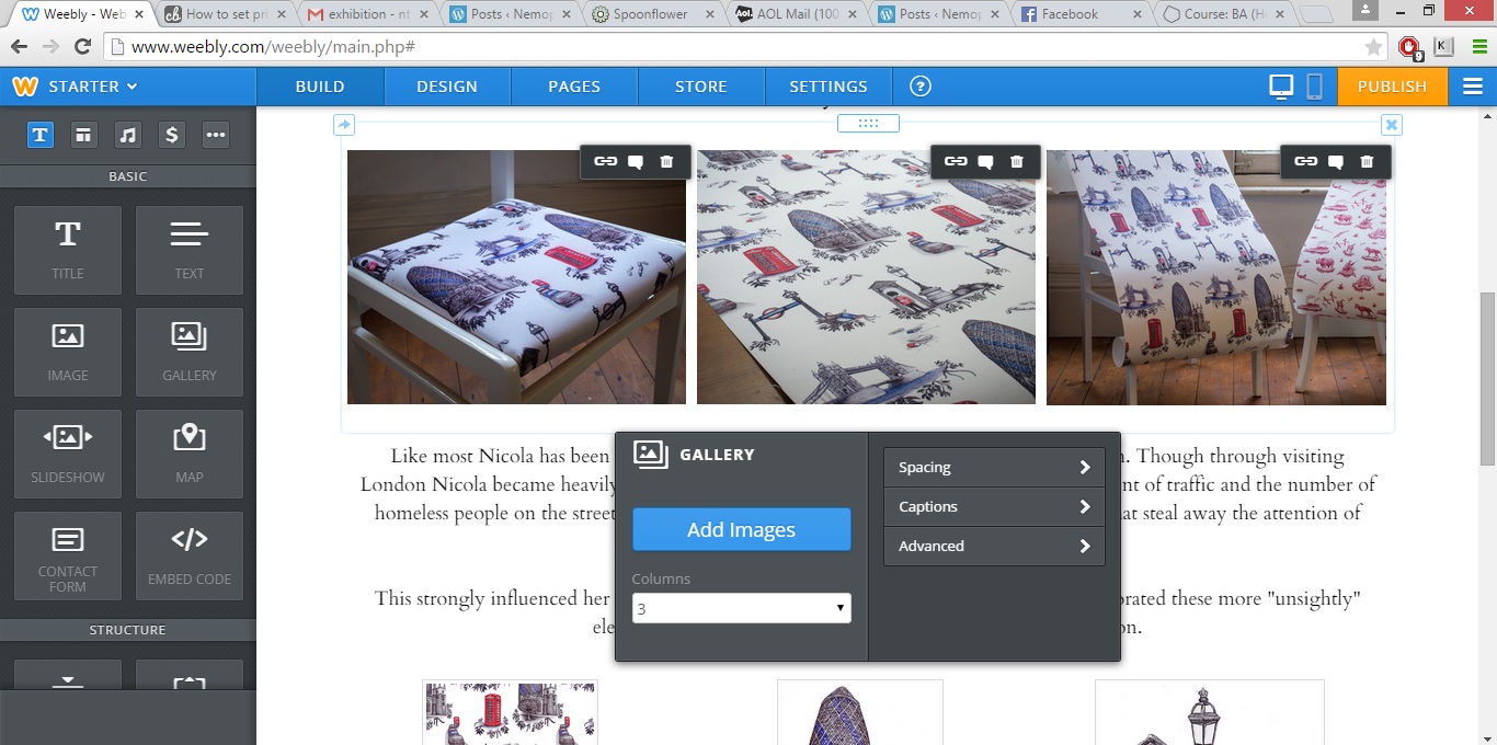
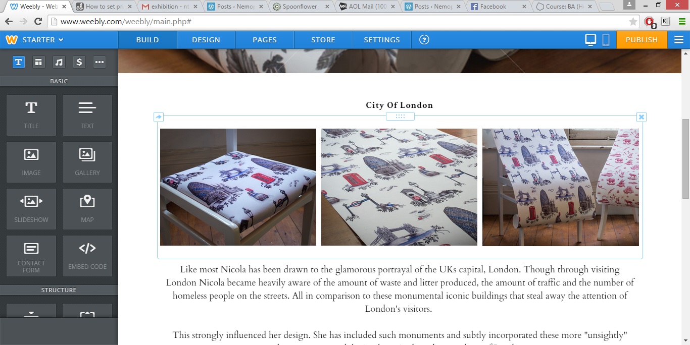
on each of my design pages, which are only visible when you click on the designs, i first added the title for my design, followed by a set of three images from my product shoot to show my designs in context. Followed by a description about my design and its different components. Then finally another gallery, this time showing the completed design and individual illustrations.
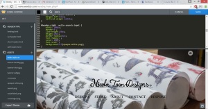
across my site i had a header image along with my header title and navigation menu. As this runs throughout my site i used one of my professional shoot images. I tried and tested a few different images before deciding that my rolls image was the best as it allowed me to show all my designs in one image without losing the menu within it. Though i did have the edit options available including the blur tool i felt these edits applied heavier changes than i had wanted, so i took my rolls image into Photoshop and blurred it ever so slightly so that my menu stood out even more. Previous to this the “design” page link was a little less clear than the other options due to the black tones in the print on the image behind it.

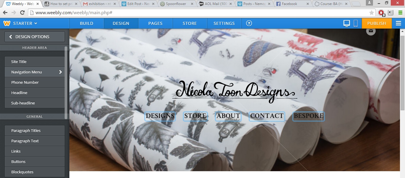

originally the Nav bar had been white text, there was no simple way to change this, the colour seems dependent on the theme. but i was able to open up the coding, scroll myself down to the nav section. Copy the colour hex value that i wanted into the colour section and apply my changes and the font was now black.
I also added a bespoke page. I have done this as i would like to continue to make and sell reupholstered chairs, but am aware that these arent exactly products i can simply sell online and post away. So i have added this page so that should anyone be interested they know that i offer this as a service and can enquire within.
Also i had wanted to make and sell my designs as wallpaper, though this costs a lot to print, and i didnt want to produce a load that may never be bought and go to waste as this is also uneconomical and the last thing i want is to be a hypocrite. So in order to avoid waste and keep costs down i will only print wallpaper to order as i have stated on my bespoke page.

To make myself appear more professional i bought my own domain through godaddy so that i had a nice clean url rather that a .weebly.com site and applied this to my site.

I published my website and its now available to view http://www.nicolatoondesigns.co.uk
 May 17, 2015
 nillypie